Daniel Ting Chong
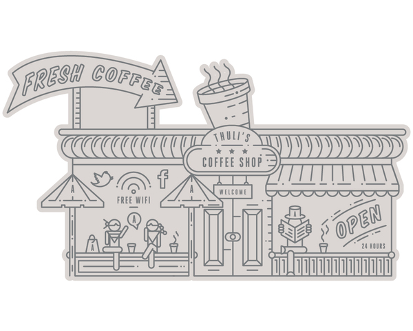
Since coming to LCA, or even looking into the world of Graphic Design I have found t hard defining what I want to do most and what I like. I come from a background of Fin Art and I love to draw, naturally i was a image student. But learning typography I chose layout and Digital design, over sketchbook drawing. The most important thing I have learnt recently is that I like combining to two, even if it is harder work.
I found Daniel Ting Chong on Behance and his illustration is defiantly created on illustrator. He is in demand in this home area and i love his style. I want to develop my illustration skills whilst maintaining a interest in type. David from placement made a great point in saying that type and layout is not a optional skill, so to say that is all I do is a bit narrow minded. I love this guys work though, a real inspiration.
Showing posts with label Taxidermy. Show all posts
Thursday, 20 December 2012
Good Concept of a magazine design
180° is a quarterly journal with an online presence, focusing on people, thoughts and actions. Its name comes from "I did a 180", for people that did a turnaround. Its content is versatile and targets a wide audience. The design is experimental and playful.
I love to see a strong concept such as 180 degrees carried through to the layout, I want to create a visual identity for a future publication focused on a solid concept. I love the use of photography and large serif type.
YWFT typeface design
You Work For Them - USA
www.youworkforthem.com
Brands like Apple, Wieden + Kennedy, EMI, Victoria's Secret, Nike, Diesel, Burton Snowboards, ABC News, Gap, BMW, Epitaph Records, Starbuck's Coffee, Wired Magazine, Cartoon Network, Sony Music, Coca-Cola, Puma, Samsung, Harvard University, Element Skateboards, American Airlines, Warner Brothers and the band U2, get design from YWFT.
I'm just interested in the Type design. Here below is a small selection from their Behance.
YWFT Nim is all about layering. Bevel effects, outline effects, 3d effects, shadow effects--all are possible and uniquely powerful with YWFT Nim, making for a near-infinite amount of variety and style. Modern and clean, with a nod to architectural forms and figures, YWFT Nim is ideal for striking headlines and posters, and declarative of a strong, individual functionality.
I want to have a brief fully based on a typeface design. I wanted to do this within the Taxidermy Brief, but I decided that photography and content was much more important.
Monday, 12 November 2012
Saturday, 10 November 2012
Friday, 9 November 2012
Taxidermy Diagrams
I tell them the 88 rule. 8' behind the shoulder and 8' down the legs. tube out legs and leave as much of the chest and the pit area as you can.
Thursday, 8 November 2012
Thursday, 25 October 2012
Typo - Booklet
things i did made some really nice fashion booklets (something I want to look into for FMP). Very 'on trend' and typographically interesting.
Wednesday, 24 October 2012
Taxidermy publication inspiration
Dale
Design and editorial proposal of a full collection of a contemporary cultural magazine.
Dale! Has the Intention of being an honest magazine, a thought magazine that makes you think.
Design and editorial proposal of a full collection of a contemporary cultural magazine.
Dale! Has the Intention of being an honest magazine, a thought magazine that makes you think.
A personal project comprising a collection of things that have influenced me as a designer over the past year, including design, photographs, textures, art, quotes and extracts from books.
The Narrator specimen displays the characteristics and technical aspects of the Narrator typeface. Printed on regular pastel letter-sized paper, the specimen is made to reflect the simple and robust nature of the font.
I love the binding!
Lura is a newspaper sized Trimestral Publication that focuses on educational events for children, visitors of the Centro Cultural Vila Flor, GuimarĂ£es.
The AF Bulletin
A series of bulletins for The Architecture Foundation. Concertina, 8 pages.
Thesis about the semantics
and pragmatics of the lost punctuation marks – which have been invented and designed to help clarifying a writer’s intention (e.g. irony) but disappeared in today’s written language.
'Printed in – The spontaneous appearance of similar opinions’ is a magazine, which intends to bring blogs and printed media together and shows that these two medias can be combined. Both of them has some qualities to exploit. In different chapters, instead of posted in called printed in, the magazine shows how blog articles can be designed on paper and in a professional way.
Kaleidoscope Supplements are a new series of monographic publications devoted to the work of international artists. The supplement is distributed worldwide enclosed to the magazine Kaleidoscope from Milan. This first issue is about the french artist Georges
Tony Stoll.
Arttu
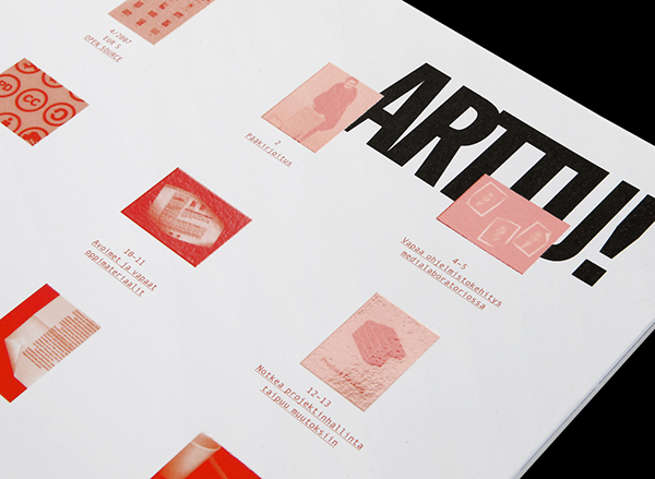
Design and layout for the 4/08 issue of Arttu, the University of Art and Design Helsinki’s quarterly magazine. Open sources and shared information were the leading themes of the issue, and were also used as an approach from a design perspective, showcasing the table of contents first thing on the cover. In collaboration with Mikko Luotonen.
Typefaces Used: Knockout, Monaco, Sentinel
Subscribe to:
Posts (Atom)