Showing posts with label Leeds Market. Show all posts

Thursday, 20 December 2012

Illustration Inspiration

Daniel Ting Chong
Since coming to LCA, or even looking into the world of Graphic Design I have found t hard defining what I want to do most and what I like. I come from a background of Fin Art and I love to draw, naturally i was a image student. But learning typography I chose layout and Digital design, over sketchbook drawing. The most important thing I have learnt recently is that I like combining to two, even if it is harder work. 

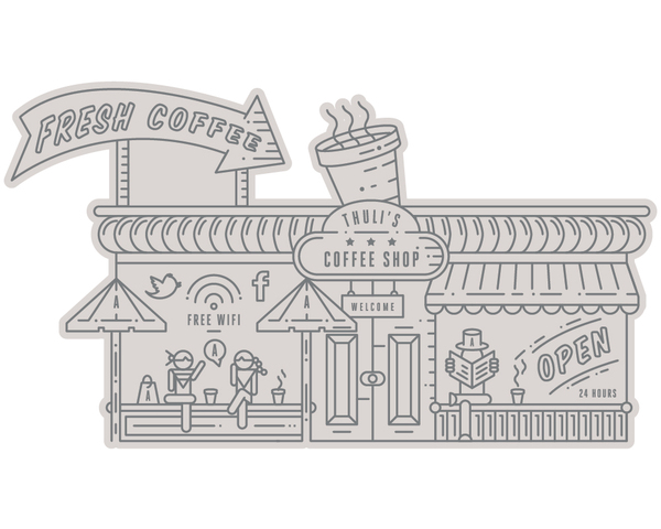
I found Daniel Ting Chong on Behance and his illustration is defiantly created on illustrator. He is in demand in this home area and i love his style. I want to develop my illustration skills whilst maintaining a interest in type. David from placement made a great point in saying that type and layout is not a optional skill, so to say that is all I do is a bit narrow minded. I love this guys work though, a real inspiration.
Tuesday, 27 November 2012

way finding

http://graphicambient.com/
http://graphicambient.com/2011/12/14/cardinal-cafe-uk/
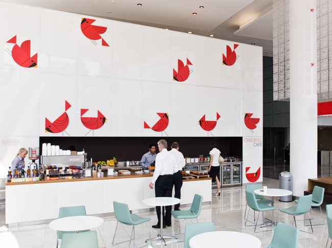
Really lovely branding of Cardinal Cafe, using a vector of a Cardinal bird to add  vibrancy. This branding applies just to this shop, not the Whole of Cardinal Shopping Place. Graphics are were applied using vinyl, which is easily updatable, allowing for the birds to ‘move’ around the area over time. I am defiantly proposing to use vinyl for Leeds Market.


http://graphicambient.com/2012/08/19/campo-santo-labyrinth-germany/
A great use of blank tiles. This is at Campo Santo (Labyrinth) in Germany. I'm not going to use a bright colours or type in this way, but Leeds Market has old flags that could be decorated and painted. 

http://graphicambient.com/2012/06/14/17th-biennale-of-sydney-australia/ (i just like this)

http://graphicambient.com/2012/07/09/royal-childrens-hospital-australia/

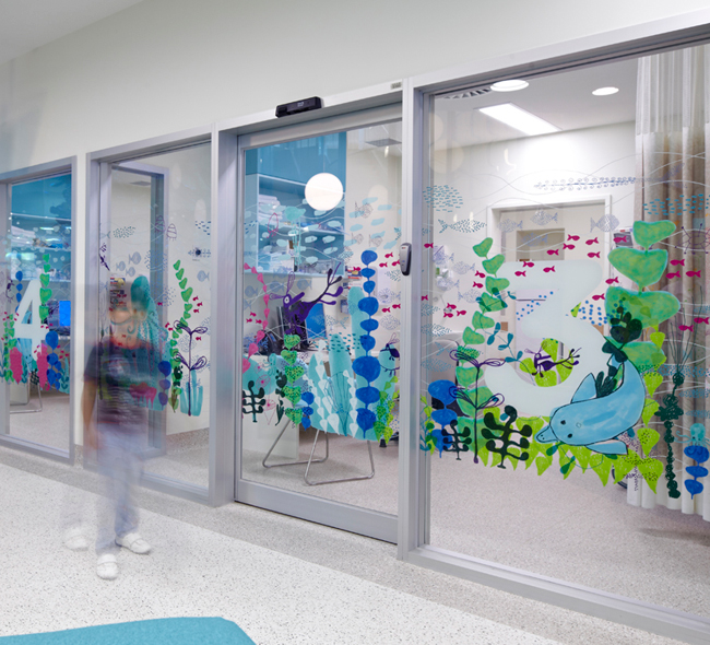
This is not the style I want, or can use (because I have already created my icons), but I really like the style. This example made me think that to get the community involved and to add a bit of involvement within the Market I could propose vinyl sticks of the icons that are use don the floor, but they are only white with thin black lines> They could be coloured in by anyone visitor. Maybe this could create a event celebrating the market, and launching the rebrand.

http://graphicambient.com/2012/05/07/paz-holandesa-peru/


A great use of Stone and looks brilliant. I like the application of the brand and the cause, a non profit Children’s hospital in Arequipa, Peru. The painted icons in the room look brilliant. There isn't enough wall space in the Leeds Market, so this wouldn't be able to work well, I think it looks best on large plain white walls.


http://graphicambient.com/2012/05/04/one-song-mural-usa/ (again i just love this use of type)

Thursday, 18 October 2012

18th Oct crit feedback: Comedy Carpet Blackpool

comedy carpet
Referring to the work of more than 1,000 comedians and comedy writers, the carpet gives visual form to jokes, songs and catchphrases dating from the early days of variety to the present. Sited in front of Blackpool Tower, the 2,200m2work of art contains over 160,000 granite letters embedded into concrete, pushing the boundaries of public art and typography to their limits.
Bolton born and bred: it seems weird that I have never heard of this before. Next time I go I will defiantly insist on having a gander. My grandparents go all the time so I bet they've seen it, I'm going to ask what they think about it, especially from a older perspective and they would have been around first hand when all of these famous comedians where around.

A remarkable homage to those who have made the nation laugh, it’s also a stage for popular entertainment that celebrates entertainment itself.

Monday, 15 October 2012

Illustration / icon inspiration for Leeds Market branding and identity.

Simple illustration using Illustrator, great for icons and family friendly colours.

The iconography I associate with the most. I love this sort of work but for children I want to use block colour, although I personally prefer this approach, block colour is what would work best.

I really like this guys illustration especially the Live to Make type, something similar to a approach I imagine would work at Leeds Market Branding. It's childish, but not too much.


My favourite inspiration for this brief. I love the shapes, the variety of forms and different styles within each design. The colour schemes are I think are a good choice. For my work I want to try and create each logo the same style and shape, so they look like they belong together.

These sorts of illustration are great, tehy all fit together but are not to the same size. The colours appeal to children and the design also works with adults.

Nice logo based on illustration.

The Leeds brand

live it love it branding
www.leedsliveitloveit.com
Marketing Leeds, a public- private partnership, needed to raise the profile of the city of Leeds. The city had low recognition nationally and internationally despite over two decades of economic growth and residents being happy with their quality of life. To make matters worse, business sectors were promoting Leeds without co-ordination or unity, which was leading to a diluted external image.

My opinion
The idea is to create a brand that everyone can use and is free so only one brand is used to stop confusion.
Despite the branding in my opinion being boring and a band choice of colour, and possibly not looking at Leeds, city and outskirts. This is certainly not a brand I would associate with Leeds, more like a corporate business. 

The idea of creating a brand that is free for residents and businesses to adopt is a good idea and something that would work brilliantly for Leeds market. 
I will brand Leeds Market place with the past in mind, focusing a family audience of present, using friendly colours naturally associated with markets and Leeds.

Leeds gov

Looking at the government website it see how they brand themselves. They do not obviously have a recognisable brand, they use the city of Leeds logo. I will not research the 

I find it really interesting to see where the logo came from and why it is still used. I think this approach is far better than the live it love it leeds campaign. With this you know it is olden and appreciate that. 

I would like to use the branding as a celebration of old, but appeal it to families in Leeds now.

Branding a city


every city needs a brand

london olympic branding

interesting corporate branding blog

NYC brand "only one, but no one NYC."

Tuesday, 9 October 2012