
Showing posts with label DanC. Show all posts
Showing posts with label DanC. Show all posts
Tuesday, 20 November 2012

Thursday, 1 November 2012
On placement David showed me this website, something that I love and in the style I want Dan's to follow. It is so well designed and thought out. Something which I need to take on that website design is exactly the same process and alterations as designing for print, you just have different considerations, and obviously different outcomes.
http://www.danielhopwood.com/


http://www.danielhopwood.com/


Thursday, 25 October 2012
Daniel promotion around hyde park
practice
I knew I wanted to use coloured stock to print Dan's promotion, as the intention is to paste them around Hyde Park. I felt bright colours with black ink would stand out against all the usual fliers.
I then remembered Raw (a studio in Manchester who I did a summer placement with) used pastel stock to print promotional posters. Here are some images below.


Thursday, 18 October 2012
18th Oct crit: Photography
richard moran
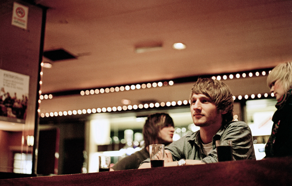
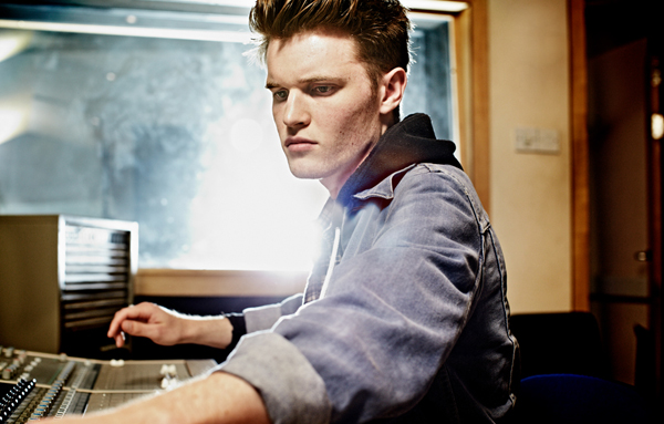
Leeds College of Music, photography. Looking at how to use depth of field to film interesting videos of Dan drumming and a good concept of what I want the filming to look like especially the style of interview.
In the photographs I have selected they all show aspects of photography I want to show in Dan's website: in a perfect scenario I would employ a photographer and filmer... but I don't have any budget and no time. I also wanted to learn the basics myself.


"With over 22 years experience in the field of photography Richard
Moran captures images that connect emotionally with audiences worldwide.
His talent for presenting structure, form and composition is combined with a thorough understanding of brand sensibilities, resulting in a body of work that is always expressive but never melodramatic."
Geordan Reid Campbell is here too! He gets around LCM.
Leeds College of Music, photography. Looking at how to use depth of field to film interesting videos of Dan drumming and a good concept of what I want the filming to look like especially the style of interview.
In the photographs I have selected they all show aspects of photography I want to show in Dan's website: in a perfect scenario I would employ a photographer and filmer... but I don't have any budget and no time. I also wanted to learn the basics myself.




Moran captures images that connect emotionally with audiences worldwide.
His talent for presenting structure, form and composition is combined with a thorough understanding of brand sensibilities, resulting in a body of work that is always expressive but never melodramatic."
Geordan Reid Campbell is here too! He gets around LCM.
Saturday, 13 October 2012
Web inspiration
Flow Festival (tsto)
As if I needed any more reason to Love tsto, but here is their website for the Flow festival they branded in Helsinki. All design stemming from this typeface they created themselves, along side unusual objects. A really nice feature to the website is that the content fits to the size of your screen. If the window is small it will have 4 columns, if you have your interent on full-screen you could have 8. The flow text fills in the gaps as the side. A nice interaction that you cannot code on dreamweaver. Obviously something I would love to be able to use, but something I defiantly cannot learn in 9 weeks and counting.


As if I needed any more reason to Love tsto, but here is their website for the Flow festival they branded in Helsinki. All design stemming from this typeface they created themselves, along side unusual objects. A really nice feature to the website is that the content fits to the size of your screen. If the window is small it will have 4 columns, if you have your interent on full-screen you could have 8. The flow text fills in the gaps as the side. A nice interaction that you cannot code on dreamweaver. Obviously something I would love to be able to use, but something I defiantly cannot learn in 9 weeks and counting.


I liked this as it has a link to a video straight away. The option to scroll down straight away is a nice touch, I have decided that I really like websites that do not have home, about, contact buttons, but just simply use the scroll.


I great website based on really good photography and illustration, which flicks through as a gif on the homepage. This is something that is not far from how I imagine Dan's website. It also has good use of columns.


Again, I can see this a website similar to my vision of Dan's. It has a video on it's homepage, it is a record label and has a lot of musical content. I feel this is a good website for reference of how music is placed well onto a website on the internet.


This website looks professional which is why I have blogged it, apart from that it is pretty irelevent as it has so much content.

I think this website is brilliant. It reminds me of roxy or billabong, it has that carefree feel about it. The type iis hand rendered and the imagery is stunning. I have never seen a website where I felt sidewards scrolling really works, but I feel this website really nails it. The scroller in near the centre of the page so the observer knows the set up straight away. I just like how easy it is to see the different parts of the website. I don't know if it is a route I would take with Dan, I surpose it really comes down to what it easier to code / how time consuming it is. It also depends if it is something Dan wants.


This is a nice website, so simple and minimalistic which is exactly what Daniel wanted.

I think I like this concept for the website, more than the actual product. I felt it was relevant to Dan as it has videos full size of the webpage, however I will not be doing that with Dan's website. Although I like how the website links out to Facebook at the end, a very clever advertisement for Eastpack.


Again I feel this is relevant to Dan as it has a full screen video playing in the background, but again I wont be doing anything like this. I felt like it would be a nice thing to show Dan, how it wont look.

A advertisement agency. A brillant use of the grid and a showcase of knowledge. I like how the squares move with one is click words apear and more other squares out of the way. A really nice effect.


A really nice website showing layout and editorial on web. I really just wanted to take note as a reminder to me that web design is A LOT to do with layout and when it's done well it is beautiful.


Beautiful use of a photographic banner, something I want to explore with Dan.


A really nice scroll website about a chippy. I seriously want to ask hos hard it is to code something like this. It just looks so good.


Such a great website, and great interaction. I really cant explain what it does, easier for you to look.


Another well designed website. Not really relevant content, but nice design.

Once again another brilliant scroll down website, clever and it works well.


To end a great website using the simple scroll down setting. I am defiantly going to find out how to do this, and if it is possible in my timetable.


Subscribe to:
Posts (Atom)