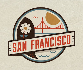
Simple illustration using Illustrator, great for icons and family friendly colours.
The iconography I associate with the most. I love this sort of work but for children I want to use block colour, although I personally prefer this approach, block colour is what would work best.
I really like this guys illustration especially the Live to Make type, something similar to a approach I imagine would work at Leeds Market Branding. It's childish, but not too much.
My favourite inspiration for this brief. I love the shapes, the variety of forms and different styles within each design. The colour schemes are I think are a good choice. For my work I want to try and create each logo the same style and shape, so they look like they belong together.
These sorts of illustration are great, tehy all fit together but are not to the same size. The colours appeal to children and the design also works with adults.
Nice logo based on illustration.


No comments:
Post a Comment