
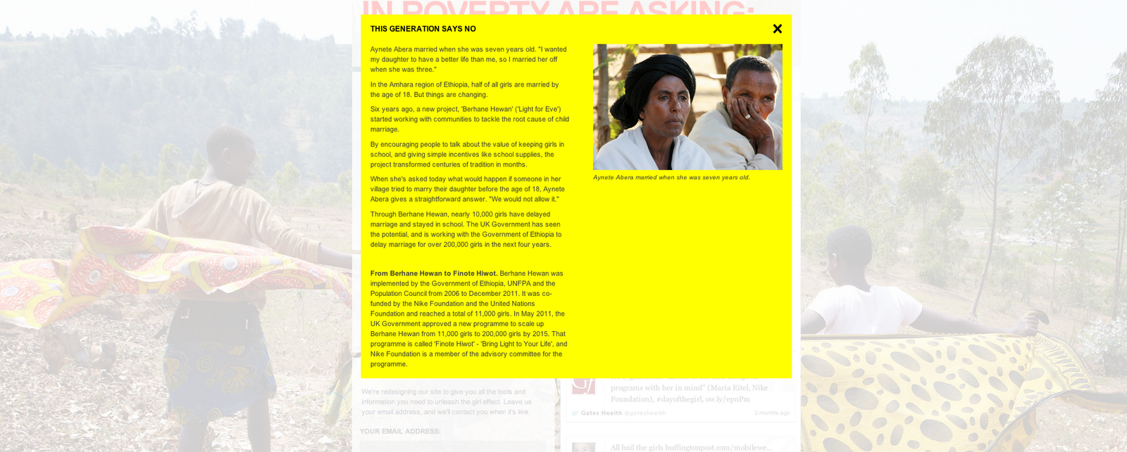
I've already blogger about this before for typosgraphe, but this is completely relevant now. I will be dealing with mass of information and trying to create a pop-up gallery of information posters, videos and booklets on 'Because I am a Girl' Campaign. I can't think of a better inspiration and a better way to share a message with a lot of new people. As said before I love the colour, but this is defiantly aimed at a younger and wider audience than 24-35 years. I'm going to stick to my target and try and use more sophisticated layout and hopefully great type skills in the info graphic posters.


It has a great website too, girl effect website


I would love to use video, this will be something I will propose Here is the Girl Effect: The clock is ticking, used along side the campaign above to get a the relevant information across in a interesting way.
Maker of the Video
The theory behind advertising the girl effect
Using the same style as the Girl Effect video, I really like the simplicity and it reminds me of Oxfam with the rough textures and use of green. I think this is brilliant for the Girl effect, but the imagery looks like it is aimed at a younger and wider audience than the 'Because I am a girl' brief. I do like how the video has gone viral and I think this is defiantly due to the character drawing the audience, I think any girl or woman would find this evoking. I would like my design to do the same. I can't get enough.


No comments:
Post a Comment