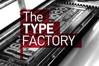
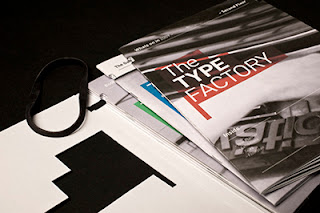
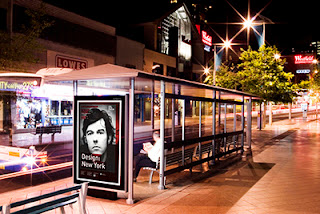
This is more the look I was after, but I feel that this is hard nose and obviously what ISTD wanted. I think me and Steph should try thinking outside of the box a bit more.
Really well thought out a beautifully presented.
Not what route I was thinking of, but vinyl stickers are good.
Very impressive, these got A LOT of coverage: Computer Arts magazine, Typography Served, Deviant Art and several other online publications. This really shows off his skill-set. I really clever idea but exhibited brilliantly.
I don't want anything as hard edge as this.
A really good concept of trying to combine the old with the new. The logo is created from the sectioning of The Letterpress and the type is inspired by the same notion.
I always find it useful to look through at others designs to see how they interpreted the brief. Me and Steph have altered the brief so most of this is not relevant or I feel represent what we are trying to do in the wrong way. I would like to create a visual identity that shows we know about Typography, its history and present. I would like our design to focus on the contemporary but also celebrate the old.


No comments:
Post a Comment