Mill-Circling-ARTMILL
Personally I do not like the design for this project. But the range they have produced and the photographing of all the work in inspiration in itself. It is also nice to see development work and the use of a grid, something that I will insist we do on our submission boards.
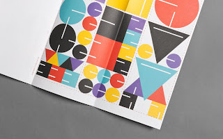
Internationale Spieltage
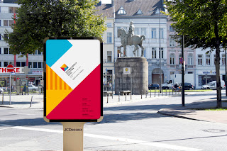
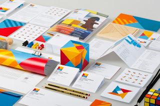
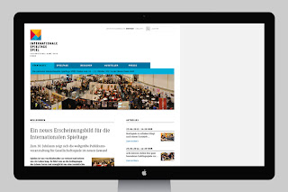
I love the design for this exhibition, I think it's clever how everything interlocks and produces such a strong identity. This is what I mean when I say brand and identity. This is also exactly the sort of work and photographs we need to produce for our submission boards, very professional and easy to understand everything. A brilliant idea, and executed extremely well.
PUBLICITE SAUVAGE 25th ANNIVERSARY EXHIBITION
Nothing else to to this but I just think these look good: eye-catching and cute.
Austausch Exchange
I just loved the front cover of this publication. Maybe me ans Steph could use board or some grain material for the cover to show progression through time?
35 years after forward
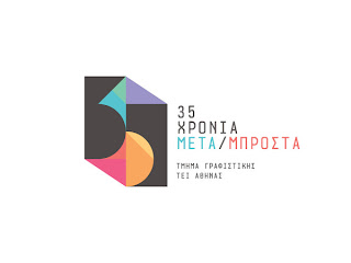
Again this shows the full development of the idea, which I think adds depth to the final design. I think the bright colours is something I want to take and use within Typos Graphe. As we need to attract attention. Maybe use lots of colour for all the advertisements to submissions. An use just one spot colour for the publication. (I don't like the type poster)
Herrmann Scheib
A reminder that good layout skills are key. I also want to use coloured stock. I think this is most to what design I want to create, simple and professional based around typography and layout skills.
Marx-Marx
I don't really understand why designers set out design work in this method, as it just makes the designs look un-real, I knoe it's the new 'cool trend'. This is not why I like this work. Once again it is the aplication to different medias and the thought of how to take it further. I must admite the logo is a bit of a guilty pleasure, I don't want to like it but I do.
Another good thing about this is that it defenalty has a sold identity.
Hyperactivitypography from A-to-Z
A professional exhibition, a brilliant idea and something I found ages ago. I love the idea, the design and the application. Just beautiful.
Design instituttet
Heydays. That says it all really. Aspirational.
Sala Ciutat
With this example I just think it is nice to see the design in context.
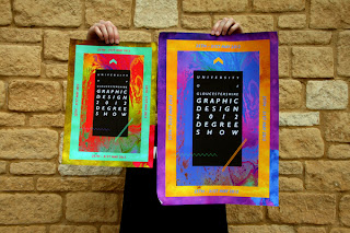
UOG, GD Exhibition PosterInvitation
Think of this as what I do not want to make. And this is the exact oppersite of what I want to design.










No comments:
Post a Comment